

Process Graph
How ProcessMind shows your mined process: read the discovered flow, replay it with animation, and use the element and connection menus.
The process graph is the central visualization in ProcessMind. It shows you how cases flow through your process, from start to finish. Understanding how to read this graph is essential for effective process analysis — Process Animation replays cases over time, and the Element & Connection Menus guide explains the quick actions behind every activity and arrow.
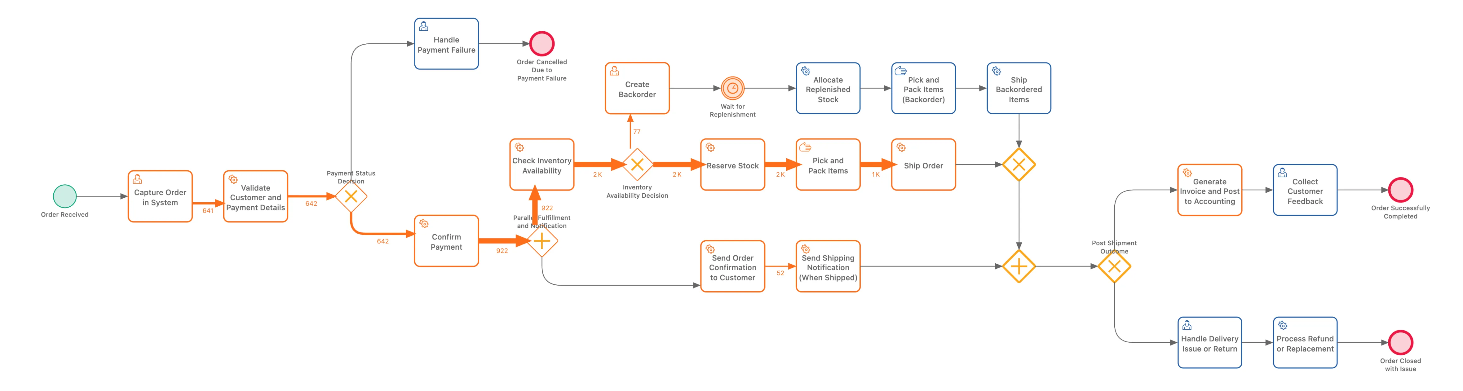
The process graph uses BPMN-like components to represent your process:
Activities are the tasks or steps in your process. They appear as rounded rectangles with:
Each activity represents something that happened in your process, for example “Order Received”, “Payment Processed”, or “Shipment Sent”.
The green circle on the left marks where cases begin. All cases flow from this starting point.
The red circle on the right marks where cases complete. Cases that reach this point have finished the process.
Discovered vs. Designed
Unlike traditional BPMN diagrams that show how a process should work, the ProcessMind process graph shows how your process actually works based on your data. The layout is automatically discovered from event logs.
The arrows between activities show how cases move through your process.
Each connection (arrow) represents a transition: cases that went from one activity directly to another. The connection from “Order Received” to “Payment Processed” represents all cases where those two activities happened in sequence.
Connections are colored based on their metric value:
| Color | Meaning |
|---|---|
| Thick/dark lines | High metric value (many cases, long time, etc.) |
| Thin/light lines | Low metric value (few cases, short time, etc.) |
The color intensity helps you quickly spot the “highways” in your process (where most cases flow) versus the “backroads” (rare paths).
The numbers displayed on connections depend on your selected metric:
| Metric | What the Number Means |
|---|---|
| Number of events | How many times this transition occurred |
| Number of cases | How many unique cases took this path |
| Avg. transition time | Average duration between these two activities, per transition |
To see different information on the process graph:
When one activity leads to multiple possible next activities, you see a split in the process graph.
Unlike traditional BPMN diagrams that use explicit gateway symbols (diamonds), ProcessMind shows splits as multiple outgoing connections from an activity.
For example, after “Review Application”, you might see connections going to both “Approve” and “Reject”. The activity has two outgoing arrows, one pointing to each possible next step.
This is simpler to read than BPMN’s XOR gateway notation, and it directly shows the real flow from your data.
When you hover over or click connections, you can see what percentage of cases took each path. For example:
These percentages help you understand the actual decision outcomes in your process.
ProcessMind focuses on showing you what actually happened rather than modeling decision logic. The connections themselves tell the story:
This is deliberately different from standard BPMN 2.0. In BPMN, several outgoing sequence flows from an activity are all followed, so a bare split means every path runs — an implicit parallel split. A discovered graph would read as “both happen” if it used that convention for decisions. ProcessMind therefore keeps the two apart: a choice is drawn as plain outgoing arrows, while genuine parallel execution gets an explicit AND gateway (see Parallelism and AND Gateways).
You stay in control of the model. Gateways are ordinary elements you can place freely — exclusive, parallel, inclusive, complex, and event-based gateways are all in the palette — and the discovered view never restricts what you add. Whether a split is a choice or a parallel branch is your modeling decision; the graph only reports what the data did.
This approach makes the graph easier to read while still showing all the routing information.
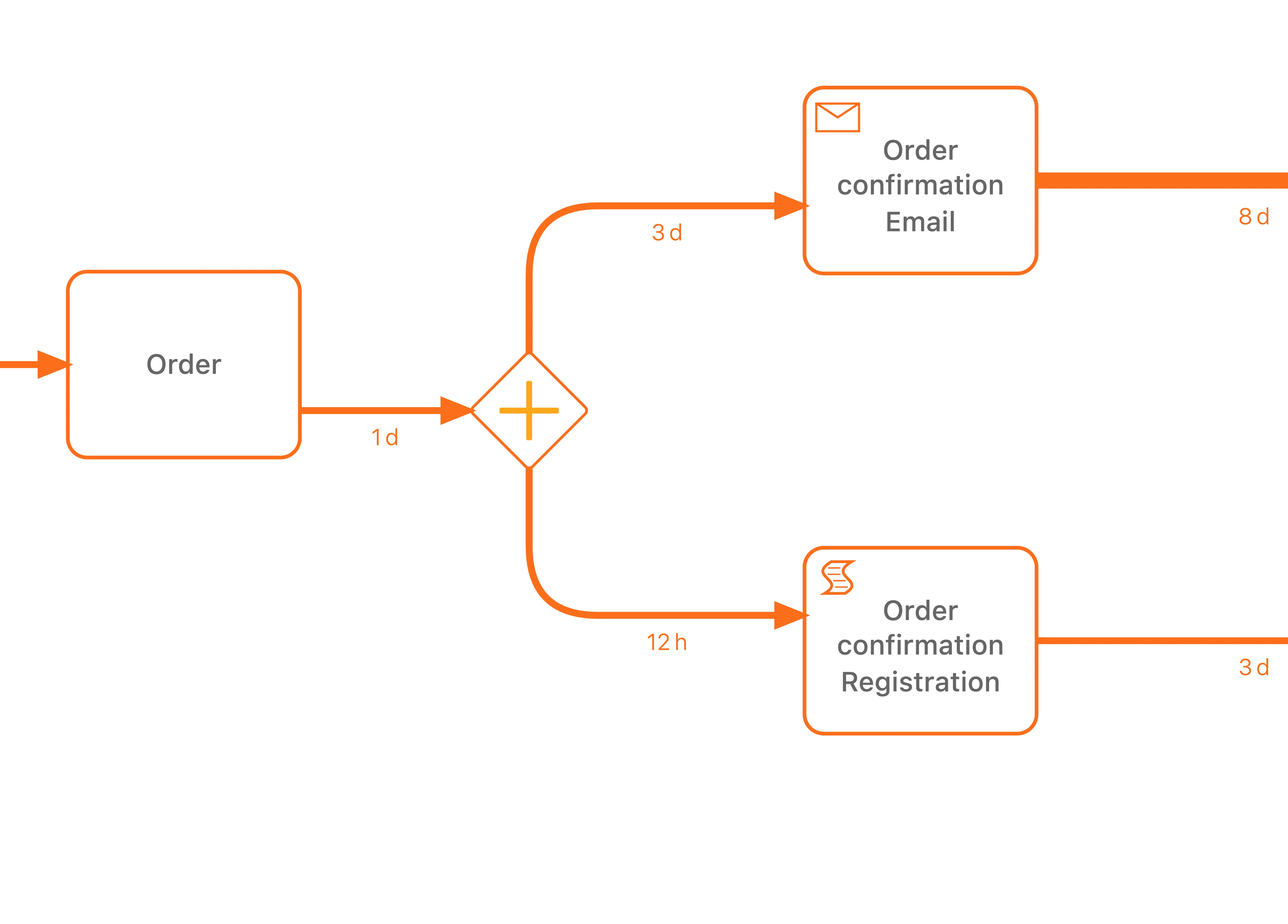
Sometimes multiple activities happen at the same time (in parallel). ProcessMind shows this with special gateway symbols.
When your data shows activities happening concurrently, you’ll see an AND gateway (parallel gateway) on the graph:
The AND gateway appears as a diamond with a plus sign (+) inside. The flow splits into parallel branches, and then merges back together with another AND gateway.
Signs that activities run in parallel:
Don’t confuse parallel execution with choice:
| Pattern | What It Means | How It Looks |
|---|---|---|
| Parallel (AND) | Both activities happen | Diamond with + sign |
| Choice (XOR) | One OR the other happens | Multiple arrows, no gateway |
If you see multiple outgoing arrows without a gateway symbol, that’s a choice point where cases take one path or another. If you see the AND gateway, both branches execute.
When analyzing parallel branches:
Complex processes can be overwhelming. The Process Detail Level control sits on the right panel, under the filters, and controls how much of the process is visible in the diagram.
As you move the slider left, less frequent elements fade out, leaving a cleaner view of the main flow:
| Situation | Slider position |
|---|---|
| Getting an overview | Less detail (left) |
| Understanding the main flow | Less detail (left) |
| Investigating edge cases | More detail (right) |
| Finding all variations | More detail (right) |
| Presenting to stakeholders | Less detail (left) |
The Process Detail Level is not the same as filtering:
Use the detail level for visual clarity; use filters when you want to analyze a specific subset.
Tip
Start at minimum detail to understand the happy path, then gradually increase detail to see where cases deviate.
Switch between different metrics to understand different aspects:
Analysis Tip
High frequency and long time don’t always go together. An activity might be rare but extremely slow, or common but quick. Check both metrics to get the full picture.
We use cookies to improve your experience, personalize content, and analyze traffic. By clicking "Accept All," you consent to our use of cookies.