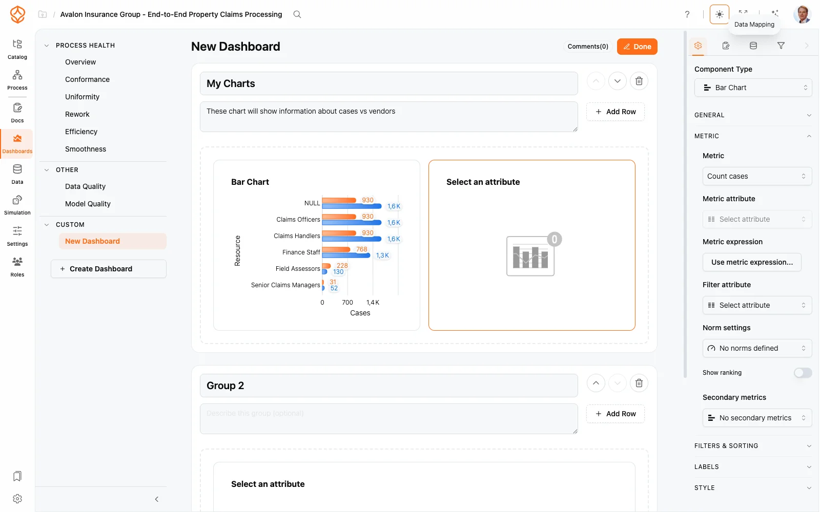
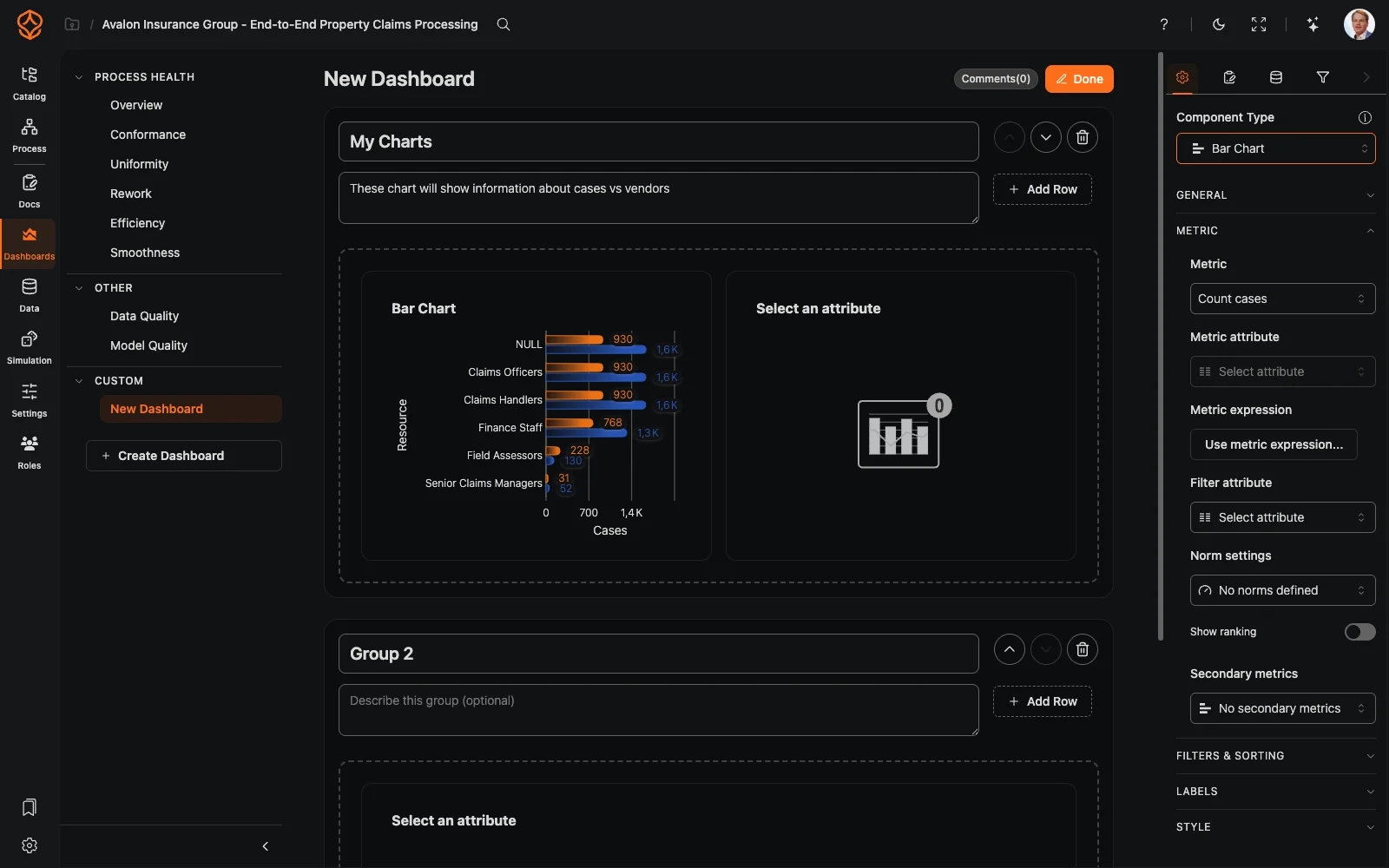
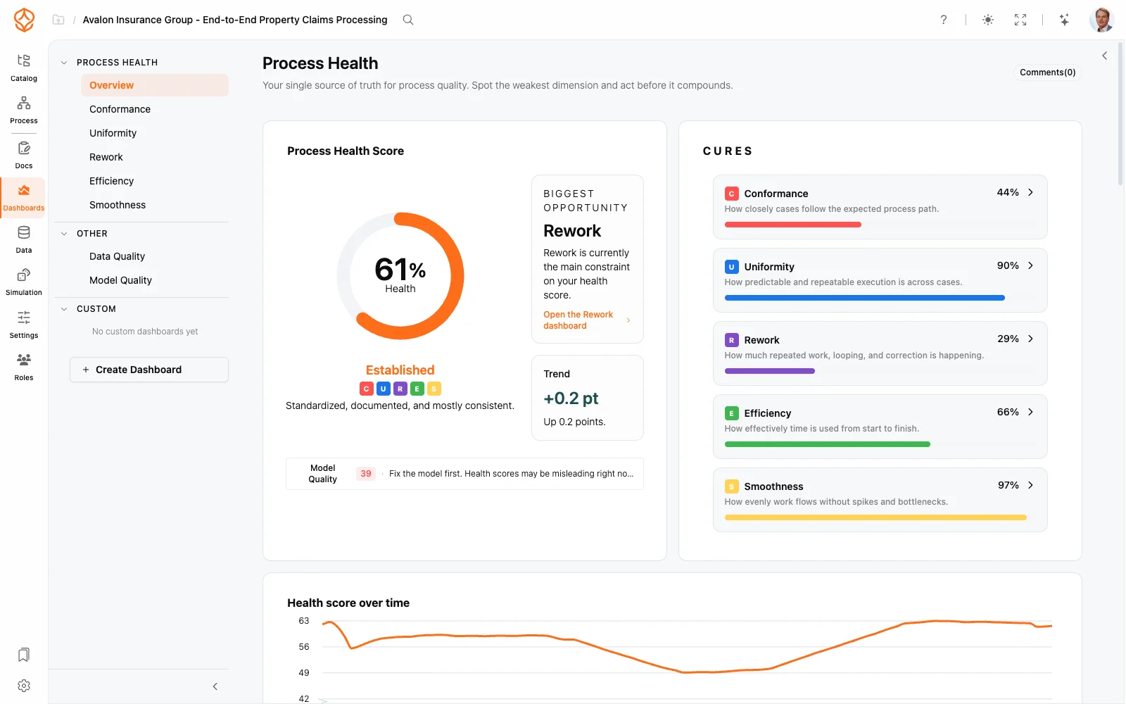
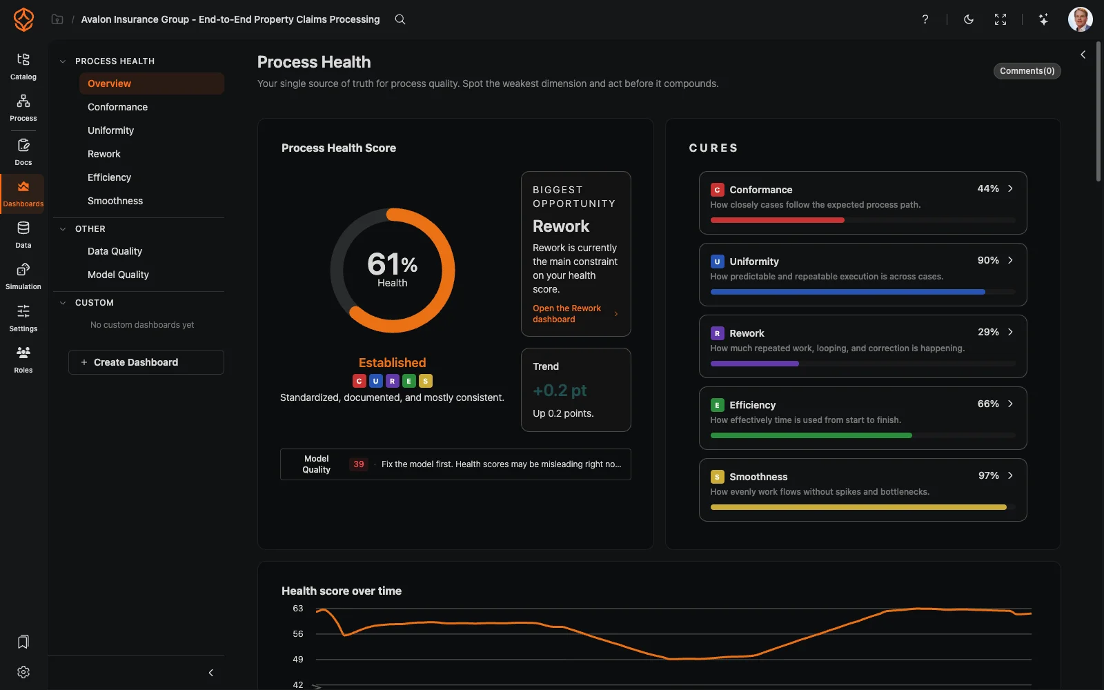
Custom dashboards let you arrange your process analysis exactly the way you need it. Instead of accepting a fixed layout, you drag in charts, metric tiles, and text, size them to fit, and group them into rows — creating a view you can share with everyone who works on the process.
Creating a dashboard
- Open the Dashboards area for your dataset — custom dashboards are listed under Custom in the dashboard list.
- Start from a blank canvas, or duplicate one of your own custom dashboards to keep an existing layout as a starting point: open the dashboard list, use the menu on the dashboard row and choose Duplicate. The copy appears under Custom with a (Copy) suffix, ready to edit. Pre-built dashboards cannot be copied into Custom yet.
- Drag elements from the library onto the canvas and configure them one by one.
Layout: containers, rows and groups
Every element sits in a container on a grid that keeps the layout aligned:
- Resize a container by hovering its edge and dragging.
- Move containers by dragging; they snap into the surrounding grid.
- Group elements into rows and sections so the dashboard reads top to bottom — headline metrics first, detail charts after.
The element library
- Charts — all process charts available for your data.
- Metric tiles — KPI tiles built on the metrics system.
- Text — annotations and context with markdown notation, or dynamic content with expressions.
- Interactive elements — filters, case lists and process views that make the dashboard explorable, using the same filters as everywhere else (see Using Filters).
Configuring elements
- Select an element on the canvas to open its settings panel.
- Choose its data source — the metric, chart type or dataset it should display.
- Style it to match your team’s conventions.
- Save — the layout is stored as a dashboard you can reopen any time.
Sharing what you built
Dashboards are visible to everyone with access to the dataset, so a good custom view becomes the team’s default. Save interesting states with Process Bookmarks, and see Modeling Canvas for the canvas controls viewers use — zoom, pan, fit to view, and the minimap.
Frequently asked questions