Process Dashboards
Explore ProcessMind dashboards: customize, analyze, and visualize your process data for business insights.
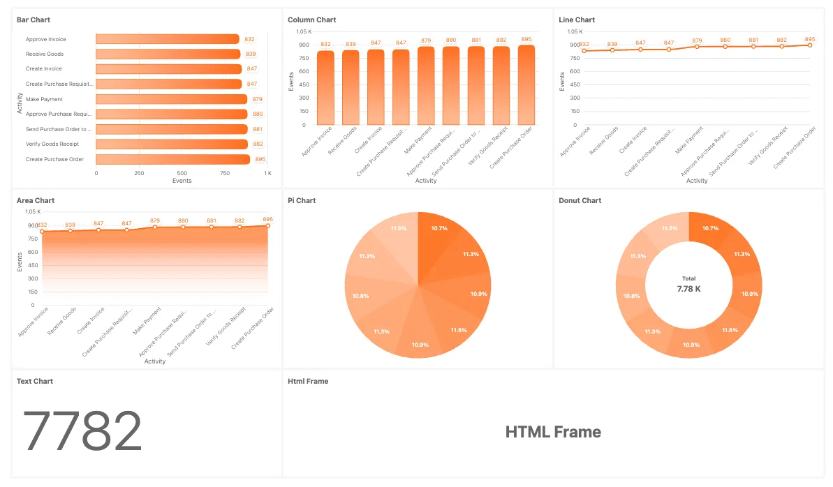
ProcessMind offers many chart types for visualizing and analyzing your process data. Each chart type highlights a different aspect of the data, so you can pick the one that fits what you want to show. Below are the chart types currently supported and the customization options available.
Bar Charts
Use to compare categories or groups side by side, such as activity counts, durations, or throughput times. Best for showing discrete data comparisons.
Column Charts
Ideal for visualizing trends over time or comparing metrics across categories vertically. Works well for time-based data or frequency distributions.
Line Charts
Use for showing trends, progressions, or changes over time, such as case throughput over days or weeks. Great for continuous data.
Area Charts
Similar to line charts but with the area below the line filled in. Use to emphasize the magnitude of change over time or the cumulative effect of trends.
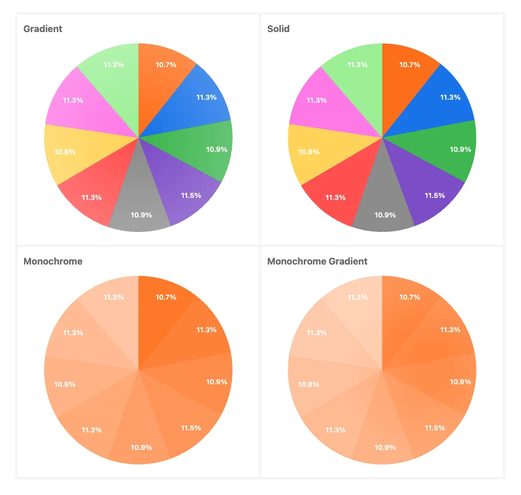
Pie Charts
Use for displaying proportions or percentages of a whole, such as activity types within a process or case distribution.
Donut Charts
A variation of pie charts, with a central space for additional information. Ideal for highlighting proportions while providing context in the center.
Radial Bar Charts
Use for grouped or categorized data in a circular format, comparing datasets while saving space.
Gauge Charts
Use for displaying progress toward a goal or KPI. Ideal for showing performance metrics at a glance or showing the number of cases in comparison with the total number of cases.
Text Charts
Use for displaying key statistics, metrics, or highlights in a textual format. Ideal for summarizing numbers or KPIs alongside visual charts. Text Charts can also add context or explanations to the data they present. Because they support markdown notation, you can format the text with bold or italic and include tables and images. For more information, see the documentation about Markdown. You can also mix text with expressions from the metrics and calculations to support dynamic content generation.
HTML Frames
Use for embedding external or dynamic content within your dashboard, such as custom charts, reports, or additional visualizations not natively supported.
| What you want to show | Chart type |
|---|---|
| Compare categories or groups (activity counts, durations) | Bar or Column |
| A trend over time (throughput per week) | Line or Area |
| Proportion of a whole (share of activity types) | Pie or Donut |
| Progress toward a goal or KPI | Gauge |
| A single headline number or summary | Text Chart |
| External or dynamic content | HTML Frame |
These are data-level charts that are preset and available for use in ProcessMind:
You can attach these charts to attributes from a single dataset or multiple datasets, as long as they share a common element.
ProcessMind can track the carbon footprint of your processes. When your dataset includes a CO₂ column, you can visualize emissions per activity and bring them into your dashboards:
Sustainability metrics are available with a Process Intelligence seat or higher.
Each chart in ProcessMind can be customized with the following options:
Chart title:
Set a custom title for the chart. If not specified, the chart uses the element’s default display name (for example, “Events”, “Cases”, or “tCO₂e per activity”).
Chart attribute: (not available for: Gauge Charts, Text Charts, HTML Frames).
Select the attribute represented in the chart. The label varies by chart type (for example, “Bar attribute”, “Column attribute”, “X-axis attribute”, or “Slice attribute”). These attributes are color-coded by dataset, so you can identify specific elements at a glance.
Text: (only available for: Text Charts).
In this input attribute you can specify rich text using markdown notation to format the content. This allows you to create headings, lists, bold, or italic text, and more. For more information, see the documentation about Markdown. You can also mix text with expressions from the metrics and calculations to support dynamic content generation. With Text is Markdown off, the text opens in the Expression Editor: literal text stays as written, ${ ... } segments are evaluated, and your changes apply when you save the editor.
HTML: (only available for: HTML Frames).
Embed custom HTML content within the chart container. This allows for greater flexibility in displaying information and integrating external content. The HTML opens in the Expression Editor and applies when you save it. A default HTML template is given to manage DARK and LIGHT mode themes inside the HTML frame. You can also use the expressions and elements used in the Text section like ${metric} or ${total - metric}.
Each metric is detailed in the Metric Documentation:
You can define custom norm ranges for your gauge charts to signal, for example, “good,” “caution,” and “warning” zones. Open the Norm Settings panel to add or edit these ranges. (You can add as many norms as you like)
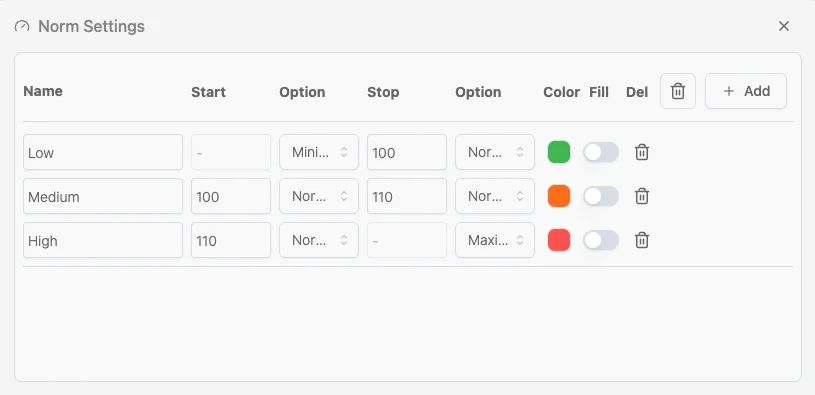 To configure a norm:
Start / Stop
Expression overrides
Click the ƒ icon on a norm row to base a boundary on an expression instead of a fixed number. Expressions are resolved from Process Settings constants, for example slaTargetDays * 86400000 or slaTargetDays * 86400000 * 1.5. They open in the Expression Editor and apply when you save it.
Options
Next to each boundary is a dropdown (Option) that defines how the boundary is treated. For example:
Color Click the colored swatch to pick the band’s color. Use contrasting colors for different ranges (for example, green for low, orange for medium, or red for high). If the colors don’t meet your needs, you can change them in the theme configuration under Chart colors.
How norms appear on charts. (Example: the gauge) 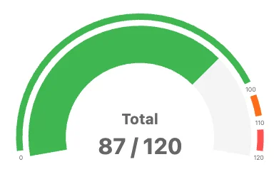
Once you apply norms, the gauge, for example, is segmented into color-coded arcs. The current value is shown with a pointer and numerically in the center. In the example below, the gauge is configured with three norms:
With a value of 87 out of 120, the pointer falls in the green band, indicating the value is within the “low” range. This also colors the indicator bar to match the range it is in.
Setting norms this way gives viewers immediate visual feedback about whether a metric is within acceptable limits, approaching a threshold, or outside a safe range.
Chart Filters:
Apply filters to the chart data to focus on specific subsets of information. 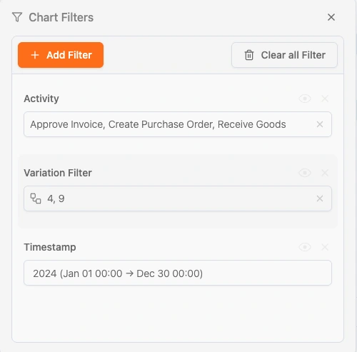 All filters that are available in the filter section of the dashboard can be applied to the chart. These filters will be added on top of the already set filters unless you set the Apply Filters to off. In that case the filters will remain static on that chart only.
Cases:
Apply the chart to All cases, Open cases, or Closed cases.
Sort by:
Choose the sorting order (Auto, Ascending, Descending, etc.).
Show Top X Items:
Limit the number of data points represented in the chart to a specified maximum.
Apply filters:
Decide if the dashboard’s global filters should apply to this chart.
Apply Time Filters:
Specify whether time filters should be applied to the chart.
By using these chart types and customization options, you can create tailored visualizations that match your analysis needs.
We use cookies to improve your experience, personalize content, and analyze traffic. By clicking "Accept All," you consent to our use of cookies.