Metrics
Learn how to use metrics in ProcessMind to analyze process data, track activity flows, and uncover insights.
Time shows up in almost every chart, and the numbers can look very different from one place to the next. That is not a mistake: ProcessMind measures time in three ways, and each way answers a different question. This page explains what each measure counts, so you can trust the number in front of you — and pick the right one for the question you are asking.
| Measure | What it counts | Counted per |
|---|---|---|
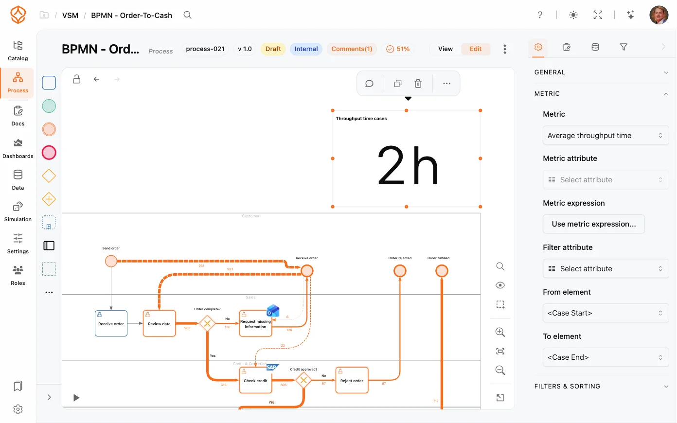
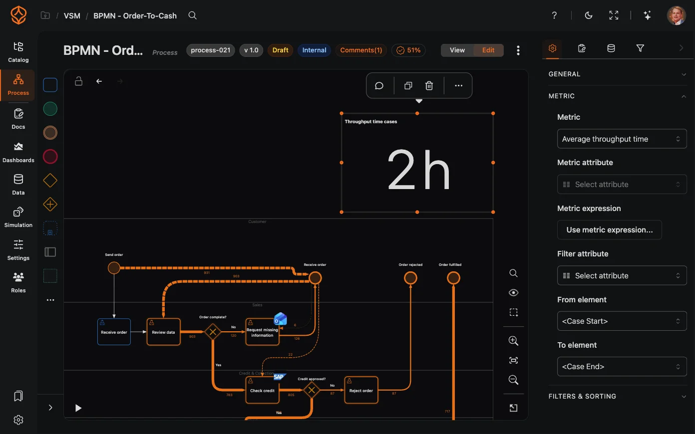
| Throughput time | How long a case takes from start to end — or between the From and To elements when the chart limits the span | case |
| Processing time | Time actually spent working on a step, from the moment work starts until the step is recorded | step |
| Waiting time | Time a step sits idle, from the previous step in the case until work starts on it | step |
The rule behind everything else on this page: throughput time describes cases, processing and waiting time describe the steps inside them.
A case can take 12 days from start to end while the work on it adds up to a few hours. The rest is waiting time: queueing, approvals waiting in an inbox, batched processing, and handoffs between people or systems.
Two numbers on a dashboard summarize that split:
The same measure is named differently depending on where you look, because each place answers a different question.
| Wording | What it means | Where you see it |
|---|---|---|
| Throughput time | The measure itself, for cases | Metric lists, chart labels and the standard KPI tiles: “Average throughput time”, “Median throughput time”, “Avg. case throughput time” |
| Cycle time | The same case-level number, in plain language | Dashboard charts and tiles: “Average cycle time per vendor”, “Avg. cycle time”, “Median cycle time”, “P90 cycle time”, “Slow-case cycle time over time” |
| Total cycle time | All cases added together | The Sum option in the metric list |
| Transition time | Time between two connected activities on the model, counted per transition — not per case | The connection menu and details panel: “Avg. transition time” |
| Case duration | The case-level measure when you slice instead of measure | The Case duration filter and the “Slow cases” drill-down |
| Waiting time and Processing time | The two step-level measures | Their own metrics, for example “Average waiting time per activity” |
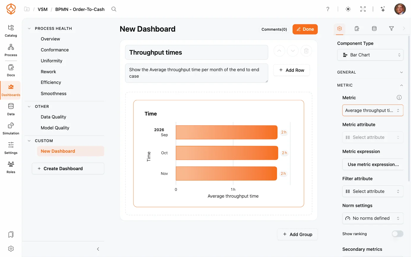
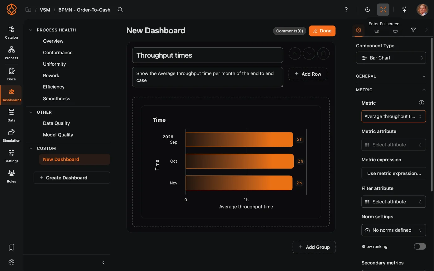
Custom dashboards let you configure duration metrics for the question you want to answer. Select the appropriate duration measure, such as throughput, processing, or waiting time, and configure the chart to show the relevant aggregation for your analysis.
A few rules of thumb:
Both numbers are correct. The chart measures the whole case, so it shows days. The connection measures the time between those two activities only, so it shows hours. Use the chart to answer “how long do our cases take”, and the connection to answer “how much time passes between step A and step B”.
Throughput time needs an end. A case that is still open has no end yet, so it cannot contribute a throughput time — that is why charts of throughput time use closed cases by default.
Open a dashboard and check two charts next to each other: one showing case numbers over time, and one showing cycle time. Then use Metrics to switch a chart to waiting or processing time and see where the time in your process actually goes.
We use cookies to improve your experience, personalize content, and analyze traffic. By clicking "Accept All," you consent to our use of cookies.