Process Graph
How ProcessMind shows your mined process: read the discovered flow, replay it with animation, and use the element and connection menus.
Clicking on activities and connections in the process diagram gives you quick access to relevant actions and information. This is often the fastest way to explore your data. When you click on an element, a menu bar pops up with basic controls for copying, renaming, and deleting the element. It also shows context-specific actions that depend on whether you clicked an activity or a connection: filter your data, view relevant metrics, and explore details without leaving the diagram.
Click on any activity (box) or connection (arrow) to select it:
Shift + Click to select multiple elements:
Double-click an element to jump straight to its filter options:
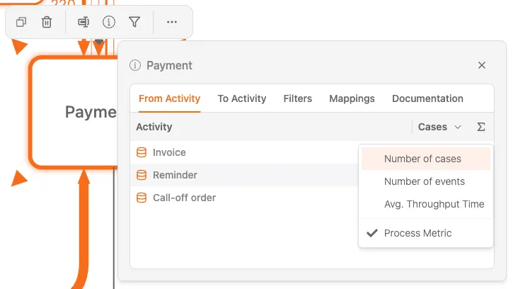
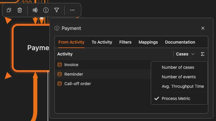
When you select an activity or connection, a details panel opens. This panel is organized into tabs that let you explore relationships, filters, and mappings for the selected element.
This tab lists all activities that directly precede the selected activity, including a Cases column showing how many cases flow from each source activity. Values can be sorted to help identify key sources.
This tab lists all activities that directly follow the selected activity, including a Cases column indicating how many cases continue to each next step.
This tab provides two filter options:
Selecting a filter immediately updates the diagram and all metrics.
This tab shows how the selected activity is mapped to higher-level or logical activities. It includes:
When an activity is selected, the details panel shows:
When a connection is selected, the details panel shows:
You can change what metric is displayed on the process diagram.
The process diagram can show different metrics on activities and connections:
| Metric Type | What It Shows |
|---|---|
| Number of cases | How many cases pass through each element |
| Number of events | How many events occur at each element |
| Avg. transition time | Average time between two connected activities |
| Cost | Cost associated with each element (if available) |
The visual intensity (color saturation or line thickness) indicates the metric value. Higher values appear more prominent.
Compare Metrics
Switch between different metrics to understand your process from multiple angles. High frequency doesn’t always mean long time, and vice versa.
When you select a connection (a path between two activities), the details panel opens with a simplified set of tabs compared to activities.
Only two tabs are available for connections: Filters and Cases.
This tab contains path-based filter actions for the selected connection:
When you click one of these filter actions, a process filter is applied immediately and becomes visible in the Filters section of the right-side filter panel.
This tab lists the cases that take the selected connection, with the number of cases that flow through it.
Here are common analysis patterns using the details panel:
The process diagram uses visual cues to highlight information:
Start with the busiest paths: Click on thick connections first. They represent your main process flow
Look for thin connections: These rare paths often indicate exceptions or problems worth investigating
Compare start to end: Select the first activity, note its metrics, then compare to the last activity
Use filters progressively: Double-click to filter, analyze, then add more filters to narrow down
Check the details panel: Always look at the detailed metrics; the diagram shows only one metric at a time
We use cookies to improve your experience, personalize content, and analyze traffic. By clicking "Accept All," you consent to our use of cookies.