Add Analytics to a Model
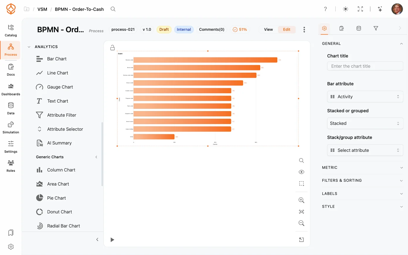
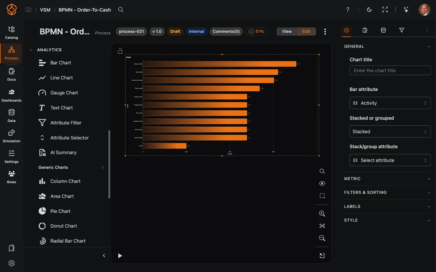
Dashboards are not the only place for analytics. In the model editor, the Analytics section of the left element palette lets you place chart elements and an AI summary directly on the model canvas, next to the BPMN shapes they describe. This keeps key numbers in the picture while you are modeling.
The Analytics Palette
Open a model in edit mode to find the Analytics section in the left palette (in the compact palette view, it sits under More modeling elements). It contains:
- Quick elements — Bar Chart, Line Chart, Gauge Chart, and Text Chart, plus an AI Summary element.
- Generic Charts — Column, Area, Pie, Donut, Radial Bar, and Html Frame charts.
- Cases — pre-configured elements such as All cases, Visible cases, Open cases, Case % through element, Throughput time cases, and the Fastest and Slowest case.
- Events — pre-configured event counts and line charts over time.
In the full palette, the sub-groups start collapsed while the Analytics section itself is open.
Adding an Element
- Open a model in edit mode — the palette does not exist in view mode.
- Expand Analytics and drag the element you want onto the canvas.
- The element is placed where you drop it and selected automatically. Charts can sit inside a pool or lane (becoming part of it), but they cannot be connected with sequence flows.
- Configure it in Element Settings (see below).
Two conveniences: dropping a chart switches the Charts visibility toggle on automatically if it was off, and the canvas zooms out if the element is larger than the viewport.
Configuring a Chart
Select a chart and open the Element Settings tab. Instead of the usual element pane you get the chart’s own settings, grouped as:
- General — chart title; for Text charts the markdown text and for Html Frames the HTML; the chart attribute and time bin; stacked or grouped options.
- Metric — the metric picker (counts, attribute aggregates such as sum and average, throughput time, processing time, cost, and ratios), the metric attribute, an optional metric expression, a filter attribute, normalization, ranking, secondary metrics, and the From element / To element for time and cost metrics.
- Filters & Sorting — chart-level filters, which cases to count (All, Open, or Closed), sorting, showing the top X items plus others, Apply filters, Apply time filters, and the null category option.
- Labels and Style.
Apply filters controls whether the chart follows the dashboard filters — switch it off to have the chart always look at all data. Apply time filters works the same way for the time interval, while other filters still apply. Chart types and every metric option are described in Process Charts and Metrics.
Keeping the Canvas Readable
- Use the Charts toggle in the right toolbar’s Process visibility panel to hide or show all charts and AI elements at once; Unmapped activities and Model-only elements have their own toggles there.
- Charts whose metric is bound to From/To elements automatically draw dotted connector lines to those activities, so it is clear what they measure.
Charts read the live dataset and re-render when filters change, so the numbers stay in step with the rest of the dashboard.
Frequently asked questions