ProcessMind Configuration and Setup Guide
Set up ProcessMind with ease: learn configuration, environments, billing, SSO, and more for streamlined business process management.
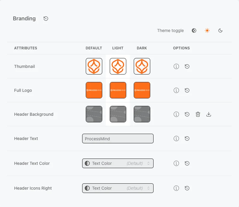
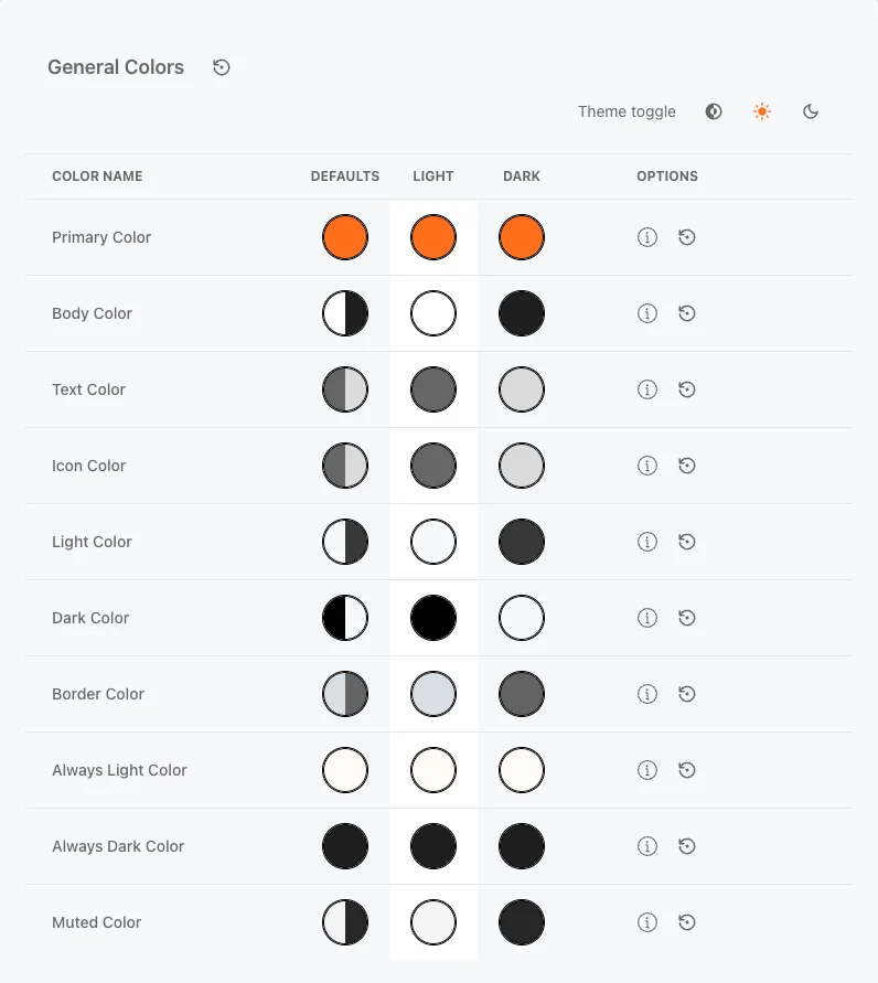
On the theme configuration page, you can customize the look and feel of your environment. Change background images, upload logos, and adjust branding elements like colors and typography to match your unique style. Tailor the user interface to reflect your company’s identity, ensuring a consistent experience for users across your platform. The theme settings are divided into five main sections: Branding, General Colors, and Model Colors.
info
Always preview and test your image selections to ensure they match your overall theme and deliver a smooth user experience.
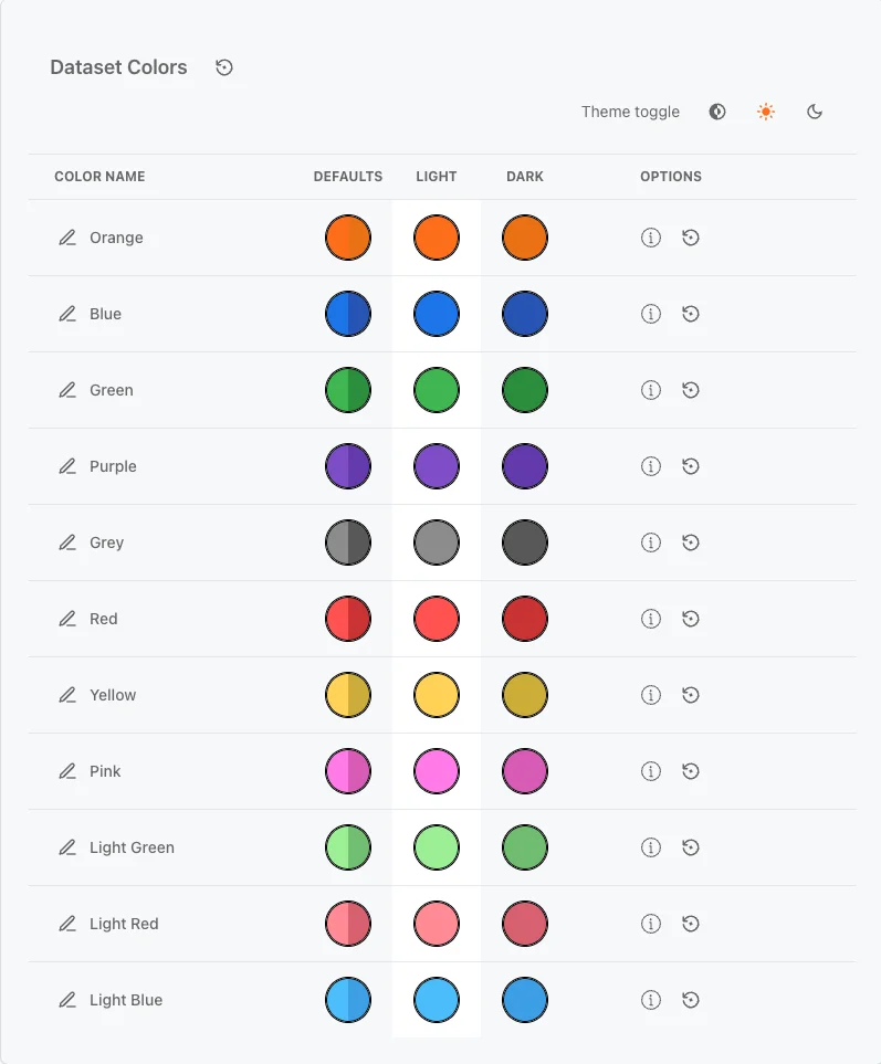
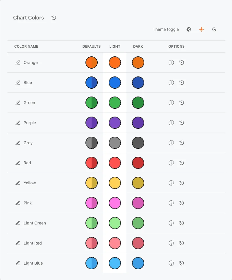
Dataset Colors
Attributes that have data attached will automatically adopt the dataset color specified in the modeler. This helps visually distinguish attributes with active data links. The colors mentioned above are the default colors for attributes without data attached to them.
 If you make changes to the theme, the color field background will indicate that updates have been made to that specific attribute.
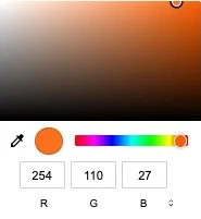 To change a color, click on a colored circle for the chosen theme (Light or Dark). A color picker appears, letting you select a shade or input a HEX / RGB / HSL value. If you’re unsure of the color values, use the PipetIcon to select a color from anywhere on the screen. Updates happen immediately.
Explore different ways to transform your application’s theme. Below, the original theme has been customized to showcase blue and green variations.
Changes made include text color, body color, panel (light) color, logo image, logo text, and header background. 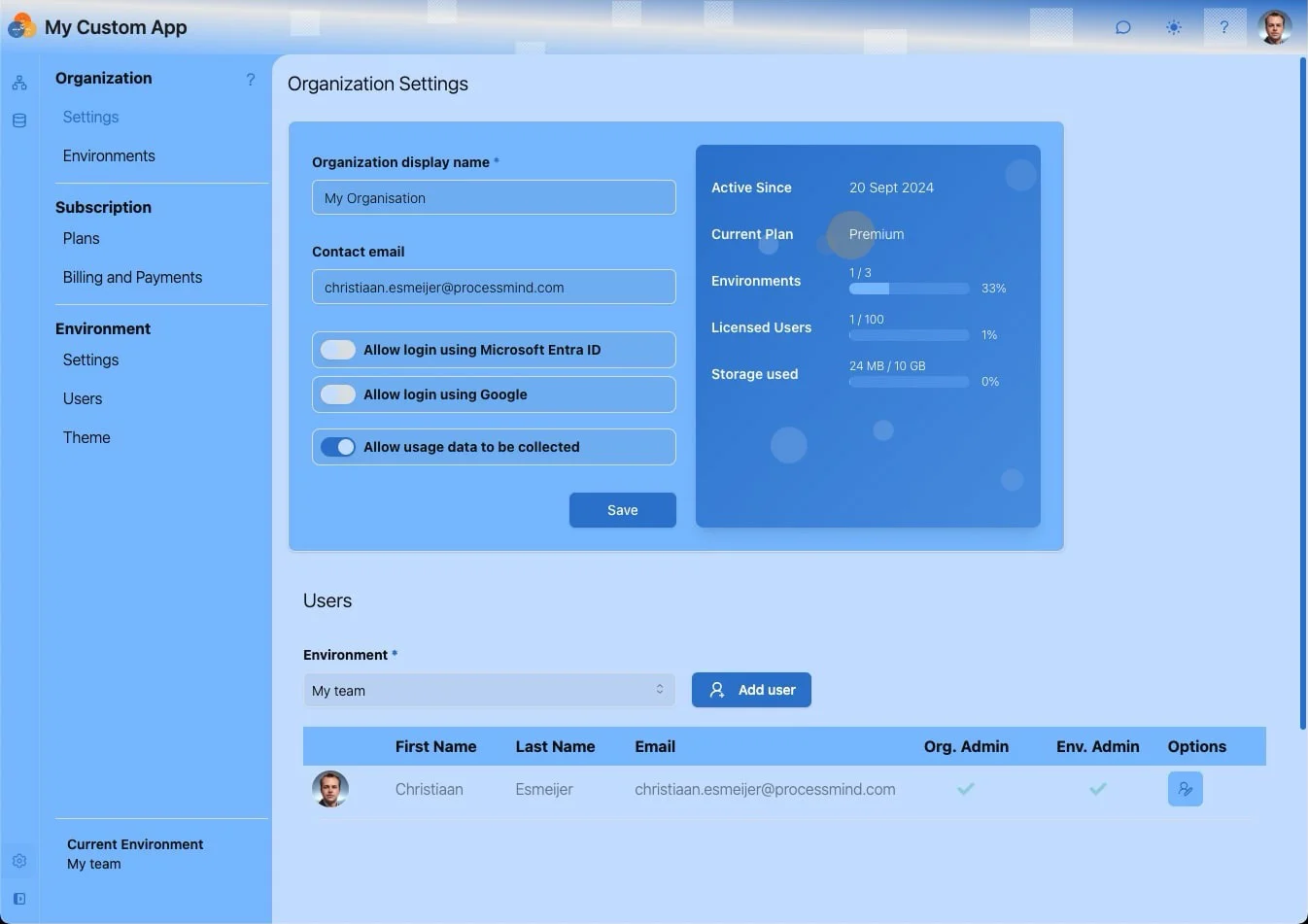
“Choice. The problem is choice.” (Neo, The Matrix Reloaded) 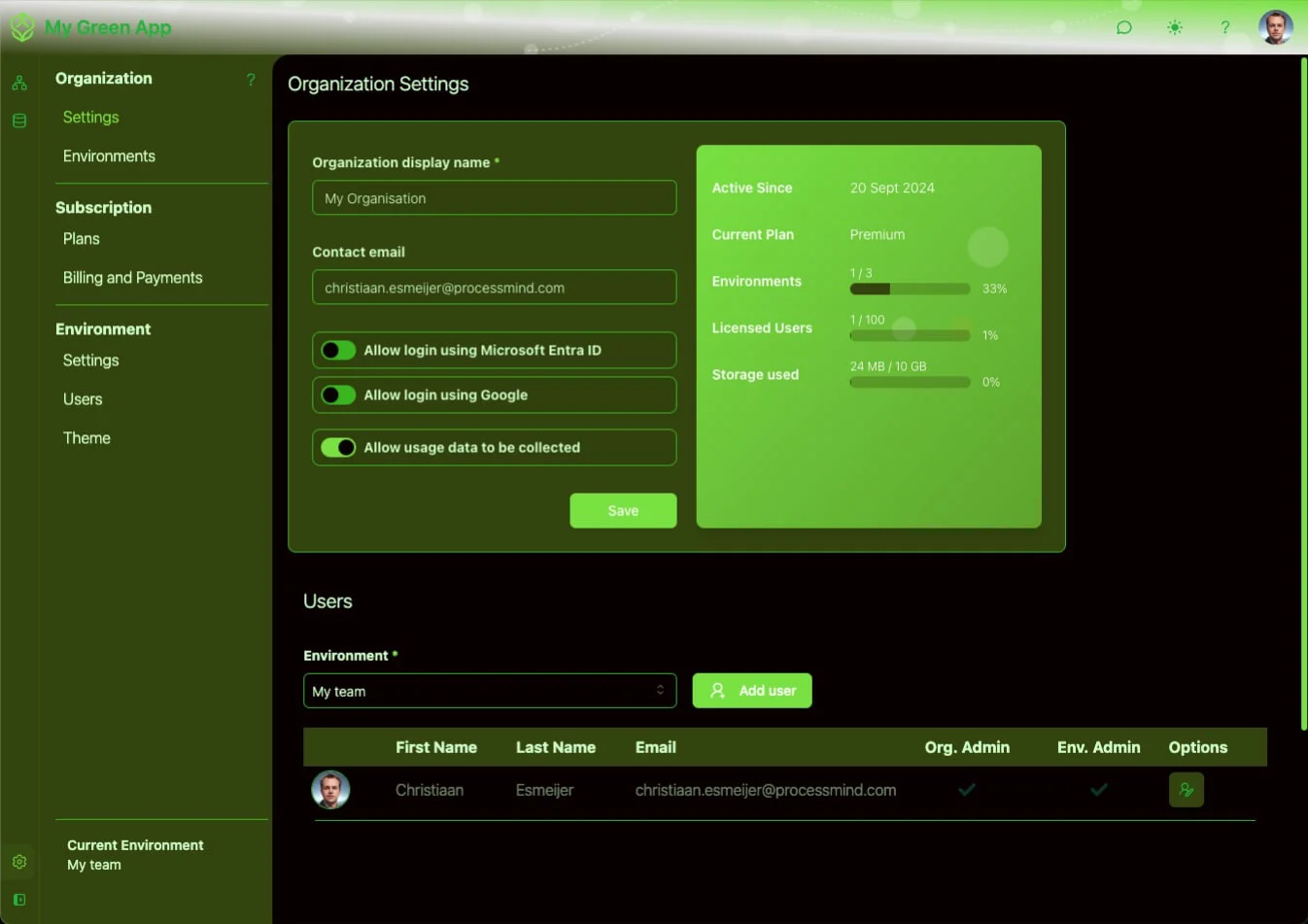
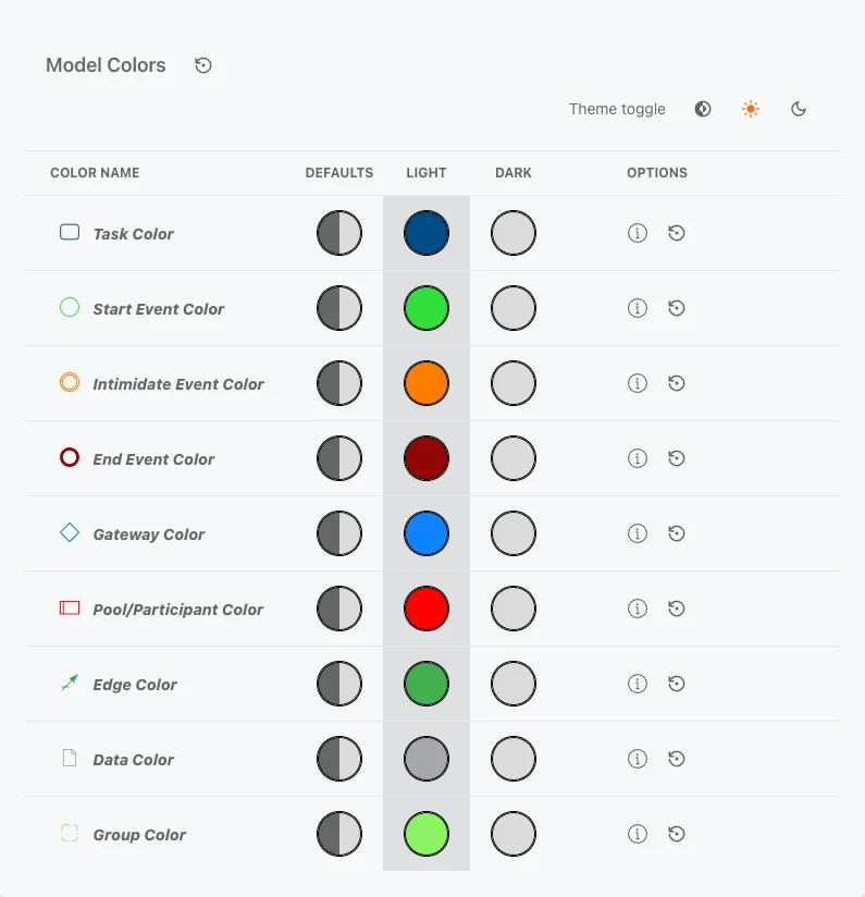
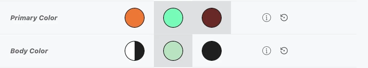
Adjust the colors of the modeling attributes to differ from the rest of the application. This ensures a distinctive look for your models. 
We use cookies to enhance your browsing experience, serve personalized content, and analyze our traffic. By clicking "Accept All", you consent to our use of cookies.