プロセスチャートの種類とカスタマイズガイド
チャート
ProcessMindは、データの可視化や分析をサポートする多彩なチャート機能を用意しています。チャートを活用することで、素早いインサイトの発見やトレンド把握、的確な意思決定が可能です。現在サポートされているチャート種別およびカスタマイズオプションは以下の通りです。
最適なチャートタイプの選び方
-
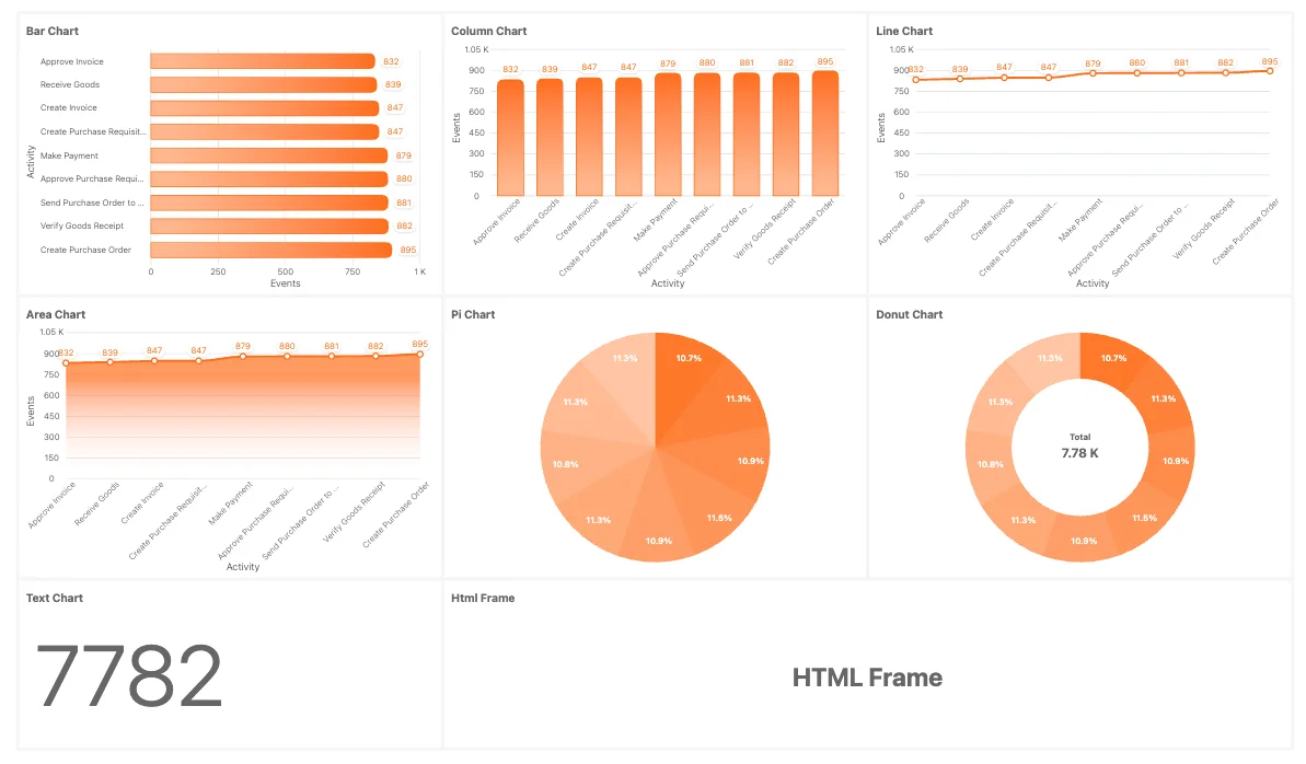
Bar Charts(横棒グラフ)
アクティビティ件数や処理時間、スループットタイムなど、カテゴリやグループの比較に最適です。離散値の比較によく使われます。 -
カラムチャート(縦棒グラフ)
時系列データのトレンド把握や、カテゴリごとの指標比較に有効です。頻度分布の分析にも適しています。 -
Line Charts(折れ線グラフ)
ケースごとのスループット推移など、時間とともに変化する傾向や進捗の可視化に最適です。連続データ向きです。 -
Area Charts(面グラフ)
折れ線グラフと同様に使えますが、線下の面積で変化量や累積効果を強調できます。期間ごとの総量を可視化したい場合に便利です。 -
Pie Charts(円グラフ)
プロセス内アクティビティの内訳やケース分布の割合表示に最適。全体に占める各項目の比率を直感的に把握できます。 -
ドーナツチャート
円グラフの中心に追加情報を配置できるバリエーション。比率を強調しつつ、中央で説明や指標を示せます。 -
ラジアルバーチャート
グループやカテゴリデータの視覚的な円形表現が可能。省スペースでデータセット比較ができます。 -
ゲージチャート
目標やKPI進捗度、ケースの件数などを一目でチェックできます。パフォーマンス指標の即時把握におすすめです。 -
テキストチャート
主要な統計値やKPIをテキスト形式で表示します。数値や指標の要約、ビジュアルチャートとの併用も最適です。markdown記法で装飾やリスト・テーブル・画像も挿入可能。詳しくはMarkdownの利用ドキュメント をご参照ください。 また、エクスプレッション との組み合わせで動的コンテンツも作成できます。 -
HTMLフレーム
ダッシュボード上で独自チャートや外部レポート、追加ビジュアルなど動的コンテンツを埋め込みたい場合に利用できます。
プリセットチャート
これらはあらかじめ用意されたデータ単位のチャートです。ProcessMindでそのままご利用いただけます:
- Casesプリフィックスチャート
- Eventsプリフィックスチャート
- Sustainability(サステナビリティ)メトリクスチャート
共通要素があれば単独または複数データセットの属性にアタッチできます。
チャートのカスタマイズオプション
ProcessMindの各チャートは、以下のオプションで柔軟にカスタマイズできます。
一般設定
-
チャートタイトル:
チャートのタイトルを自由に設定できます。未入力の場合は関連属性名が自動設定されます。 -
チャートタイプ:
現在のチャートタイプから他対応タイプへ簡単に切り替え可能です。 -
カラム属性: (対応不可:
Gauge Charts, Text Charts, HTML Frames)
チャートで表示する属性を選択します。属性はデータセットごとに色分けされ、特定要素の確認も簡単です。 -
テキスト: (
Text Chartsのみ対応)
この入力欄でmarkdown記法によるリッチテキストを記述できます。見出し・リスト・強調なども可能。詳しくはMarkdownの利用ドキュメント をご覧ください。 また、エクスプレッション と組み合わせて動的内容生成も行えます。 -
HTML: (
HTML Chartsのみ対応)
チャート枠にカスタムHTMLコンテンツを埋め込めます。情報表示や外部連携を柔軟に実現。デフォルトのHTMLテンプレートにはDARK/LIGHTモードの切り替えポイントを記載しています。 Textセクション同様の${metric}や${total - metric}のexpressionも利用可能。
メトリクス
各メトリクスの詳細は下記Metricガイドをご覧ください:
- Norms(基準値)設定:
ゲージチャートで「良好」「注意」「警告」などのゾーンを独自設定できます。ノーム設定パネルで範囲の追加・編集が可能です。 (必要数だけ基準値バンドを追加できます)
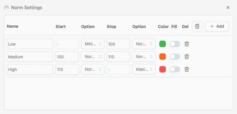 基準値設定手順
- 新規基準値の追加
開始 / 終了
- 最小値/最大値 — バンドをチャート全体の最小値または最大値に固定します。
- 通常 — 入力した数値をそのままバンドの基準として使用します。
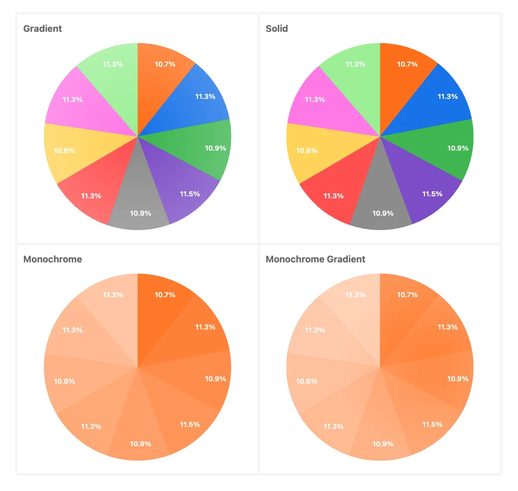
色 色付きのスウォッチをクリックして、バンドの色を選択します。範囲ごとに異なる色(例:低は緑、中はオレンジ、高は赤)を使用すると効果的です。標準の色がニーズに合わない場合は、テーマ設定の「チャートの色」から変更できます。
- 塗りつぶし 「塗りつぶし」のオン/オフを切り替えて、基準値(ノルム)をチャートの背景として表示するか、単なる線として表示するかを選択します。これは棒グラフと列チャートにのみ適用されます。
- 削除 ゴミ箱アイコンをクリックして、基準値バンドを削除します。
⸻
- 塗りつぶし 「塗りつぶし」のオン/オフを切り替えて、基準値(ノルム)をチャートの背景として表示するか、単なる線として表示するかを選択します。これは棒グラフと列チャートにのみ適用されます。
- 削除 ゴミ箱アイコンをクリックして、基準値バンドを削除します。
⸻
- 低:最小値~100(緑)
- 中:100~110(オレンジ)
- 高:110~最大値(赤)
基準値を適用すると、例えばゲージチャートは色分けされたアーク(円弧)状のセグメントに分割されます。現在の値は指針と中央の数値で示されます。以下の例では、ゲージに3つの基準値が設定されています。
フィルターと並べ替え
120点満点中87点という値の場合、指針は緑色のバンドを指し、値が「低」の範囲内にあることを示します。これに合わせて、該当する範囲の色がインジケーターバーにも反映されます。
フィルターと並べ替え
- データラベルの表示:
チャート上の各ポイントにラベルを表示するかどうかを切り替えます。 - X軸ラベルの表示:
X軸ラベルの表示/非表示を切り替え、カスタマイズを行います。 - Y軸ラベルの表示:
Y軸ラベルの表示/非表示を切り替え、カスタマイズを行います。 - 凡例の位置:
凡例の表示位置(上、下、左、右)を設定します。
ラベル
スタイル
スタイル